BLOG
We’d like you to get to know us a bit better so welcome to the news,
reviews and insights from the Mansfield Monk team.
We’d like you to get to know us a bit better so welcome to the news,
reviews and insights from the Mansfield Monk team.
It’s week two of our #MMInColour 2018 campaign and this week we’re looking at branding. Branding shapes the perception of a business and colour is a strategic part of this with research showing that association with colours increased brand recognition by up to 80%! In fact colour plays such an important role in branding that many companies have trademarked their colour to ensure the brand exclusivity. Here are a few of our favourite examples of colour in branding…
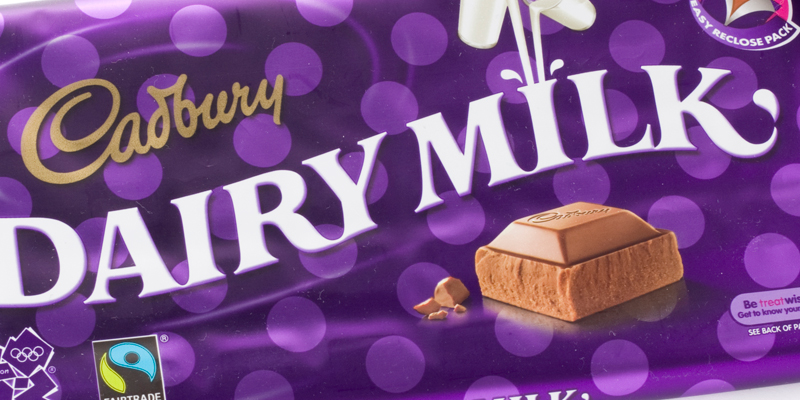
Cadburys
Let’s face it, this isn’t a favourite of ours just because of the colour but this distinctive brand has been using purple for its branding for over a century. The Quaker Cadbury brothers, who were loyal supporters of the royal, introduced the colour in 1914 in tribute to Queen Victoria – her favourite colour but have spent years trying to trademark their purple against rivals Nestlé. The High Court battles for Pantone 2685C only applies to milk chocolate bars and drinks so the rest of us can paint our houses top to bottom in it if we like!
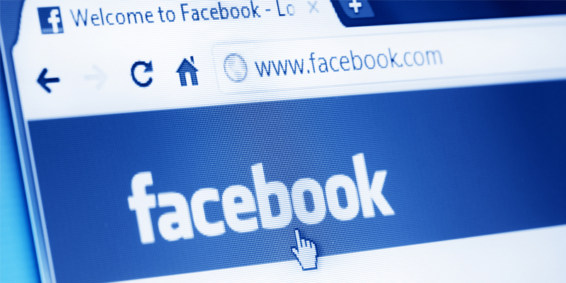
Even Mark Zuckerburg can see Facebook blue
Facebook
Love it or hate it Facebook and blue go together like cats and aloofness. The colour blue dominates Facebook pages but the branding was only originally designed this way due to Mark Zuckerberg’s green-red colour blindness, with blue being the richest colour he can see. That being said many social media and technology companies use shades of blue for their branding with the connotations of a calming, trustworthy and communicative hue.

Land Rover green, the accidental logo
Land Rover
Launched in 1948 Land Rovers came in a choice of green, green or green thanks to a surplus of army helicopter cockpit paint at the Rover factory. So functional was the vehicle that there really wasn’t a logo, just a model nameplate, up until 1978 and even this was said to be a practical accident with the designer’s lunch of a tin of pilchards leaving a stain on the drawing which would evolve in to the Land Rover oval. The green, synonymous with the vehicle, was introduced to the logo in the 1980’s.
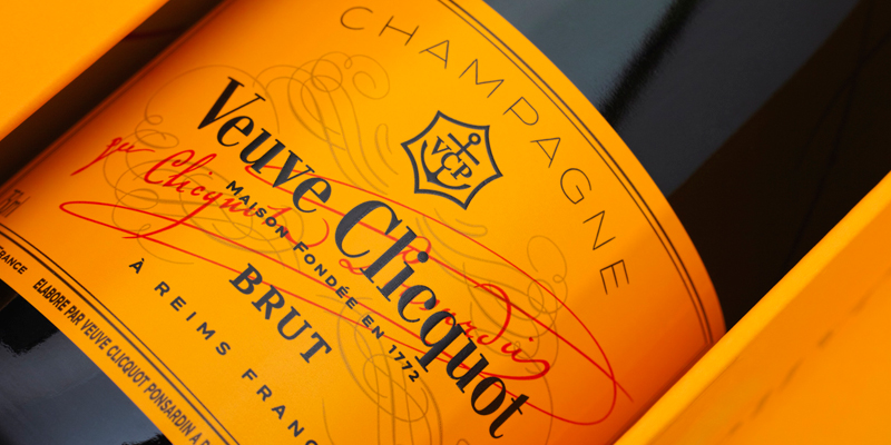
Standing out among it’s competitors – Veuve Clicquot yellow
Veuve Clicquot
Proven to catch the eye quicker than any other colour Veuve Clicquot only began using its now trademark yellow colour in 1877 when it launched it’s ‘dry’ champagne in the UK. Evolved from the original white label the yellow (an avant-garde colour at the time) was chosen as it was less likely to fade over time as and now stands out amongst the greens and creams of its competitors. Ironic given that when the champagne first launched Madame Clicquot was unconvinced at putting a label on the bottles at all believing that only a wine’s quality could account for its brand recognition.
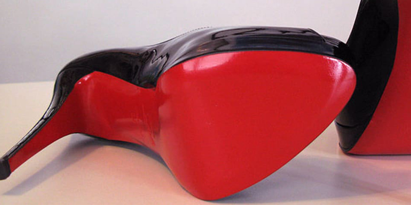
Inspired by nail polish – Louboutin red
Louboutin
Who doesn’t recognise the red-soled stiletto heels of Louboutin? In fact the iconic design came about as a spur of the moment decision when, disappointed with a shoe prototype, Louboutin observed his assistant painting her nails, grabbed the bottle and painted the sole of his prototype spawning the now signature style representative of the brand.
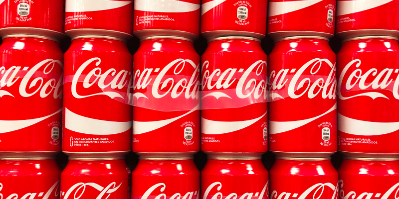
No need to trademark this iconic red by Coca-Cola
Coca Cola
And while we’re on the subject of red, perhaps the world’s most instantly recognised brand is Coca-Cola. The original logo was designed by the inventor’s bookkeeper and partner who liked the contrast of red and white with the script logo. So iconic is the logo that it has barely changed since its inception.
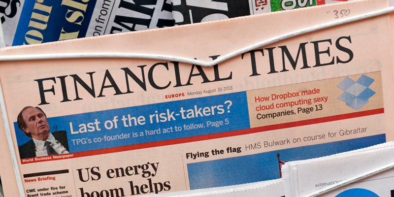
FT pink – a shrewd marketing move
FT
One of the world’s most distinctive news brands the Financial Times was founded in 1888 but began printing on the light salmon pink paper to distinguish itself from its closest rival Financial News, who it later merged with. The bonus being that it was also cheaper to print on the unbleached paper! Not so today, the paper has to be dyed to achieve the hue which has become pinker over time, parallel with the strength of the brand colour association.
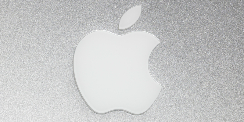
Who needs colour when you’re Apple?
Apple
After an unfortunate first attempt by Ronald Wayne in 1976, designer Rob Janoff was commissioned to design the logo and the now iconic apple emblem that we know and love was born. Initially a more colourful version and dubbed the ‘rainbow apple’, the use of colour was a nod towards the Apple II computer, the world’s first computer with colour display. By the time that Apple released their first iMac the Apple symbol was so universally recognisable, even without the company name, that it was changed to a minimalist monochromatic colour and placed where it could be seen.
Don’t forget that we are delivering a colour workshop event in London with special guests Pantone Colour Institute in partnership with Milliken Europe and you and a plus one could win the chance to attend! To enter just go over to our pinned post on our Twitter account here: http://bit.ly/2FSw0Qn T’s & C’s apply!
Next week we’ll be looking at colour psychology as part of our colour campaign.